


I redesigned Danielle Fertility’s website, evolved the brand system, and art-directed a photoshoot to build a custom brand library.
I worked with the founder to align the brand with her vision: Swiss-designed pharmaceutical packaging meets intimate, elevated and sensory.
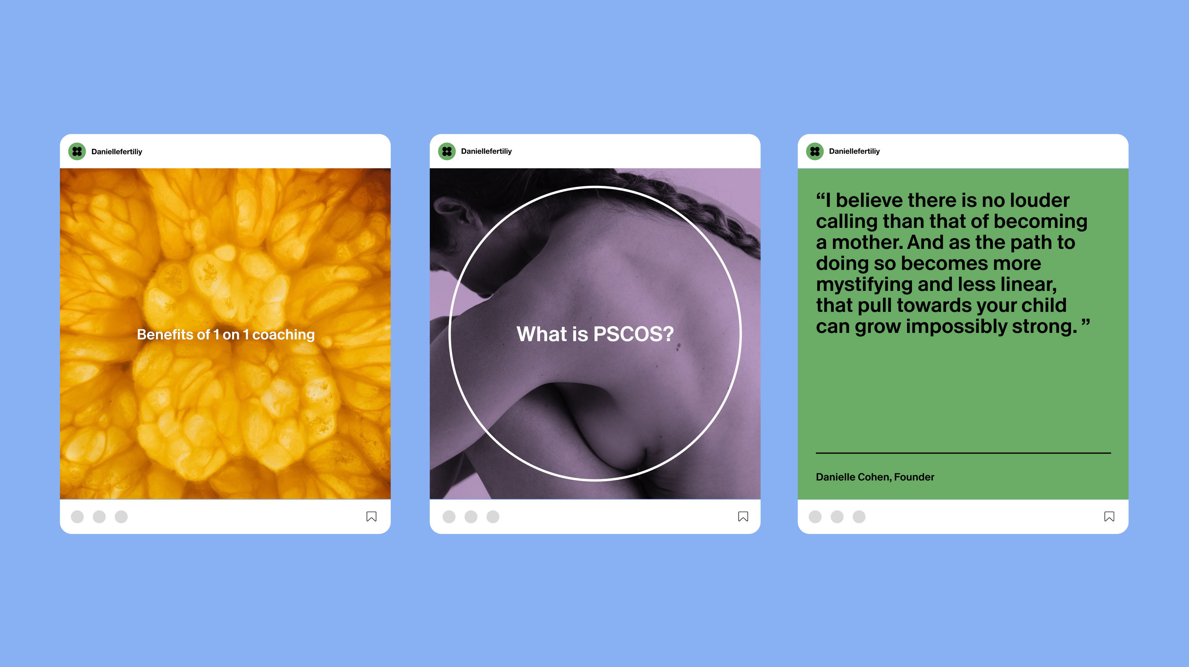
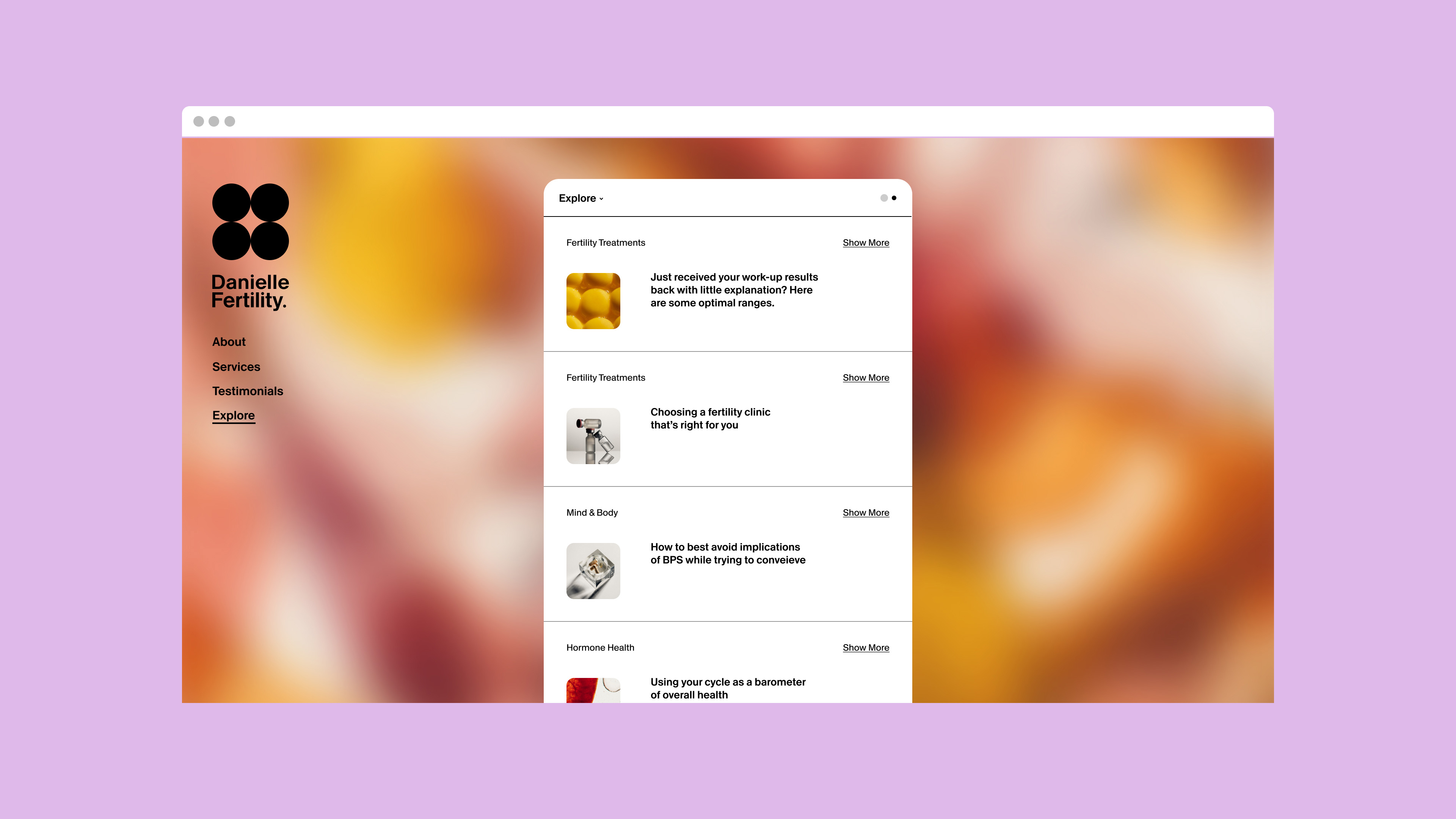
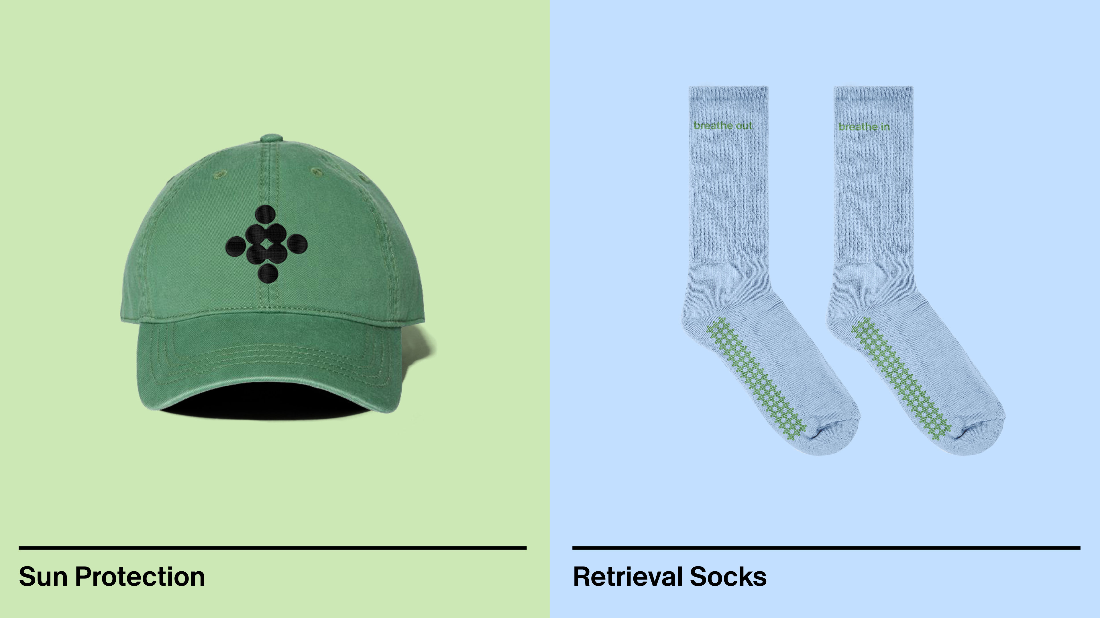
To achieve this, I introduced a more vibrant color palette, structured gridded layouts, a more legible secondary typeface, and clear guidelines for logomark and illustration usage.
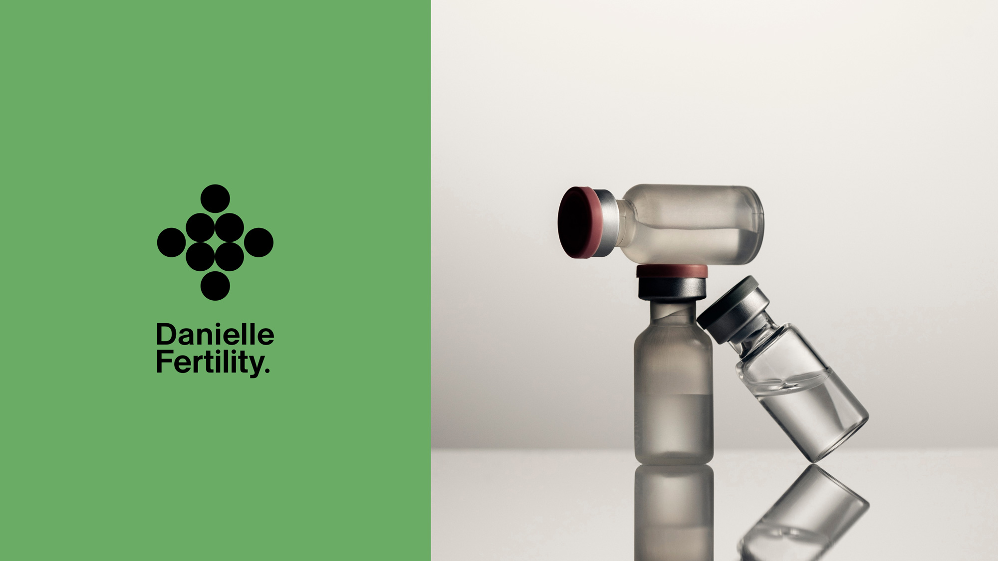
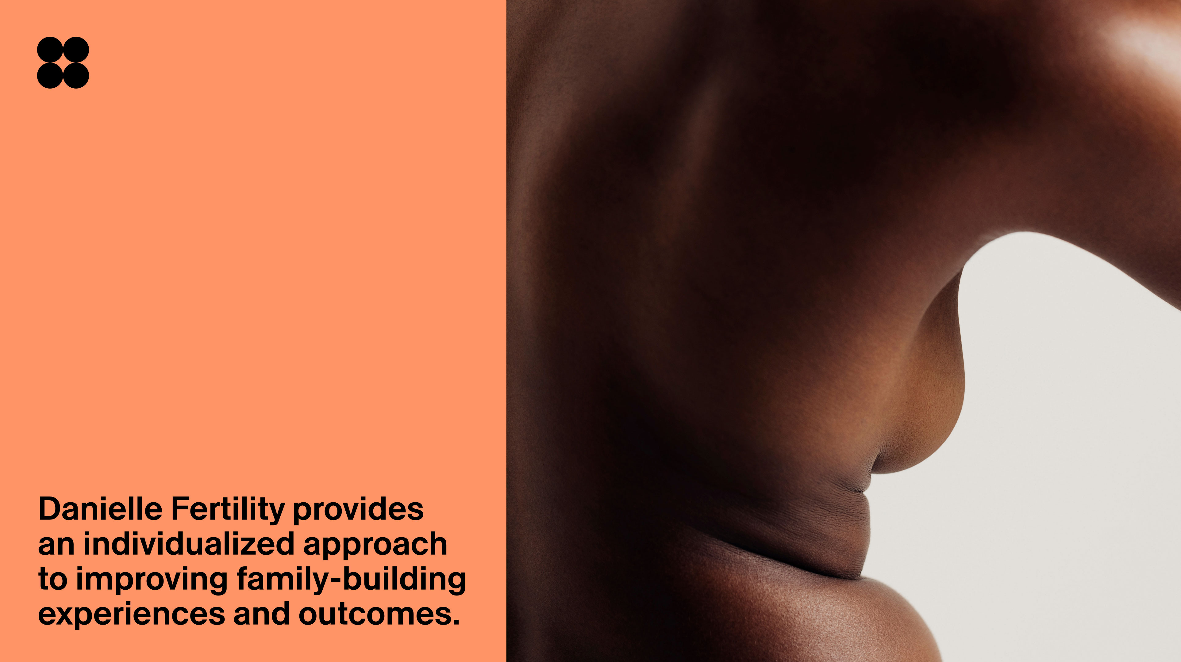
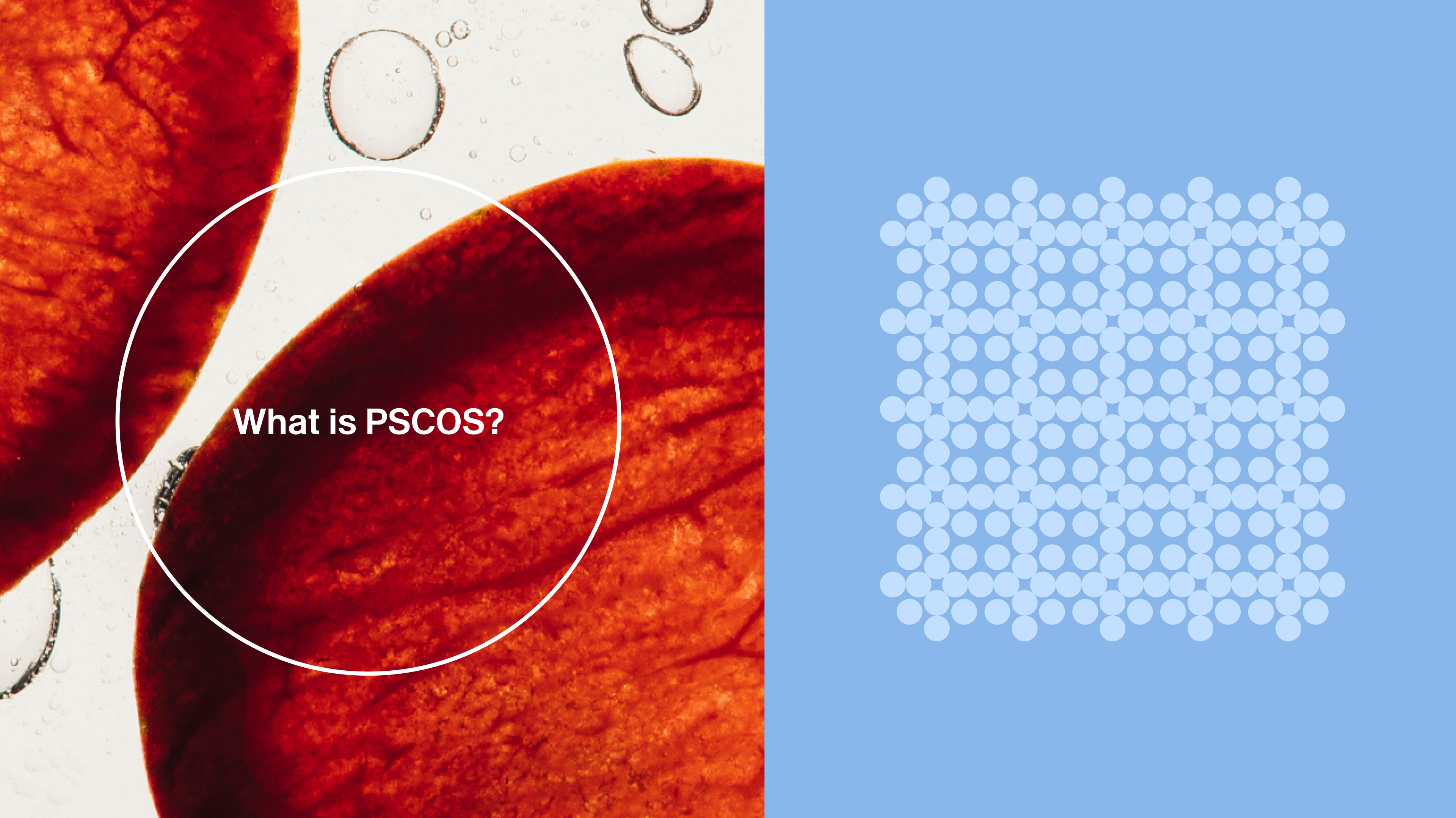
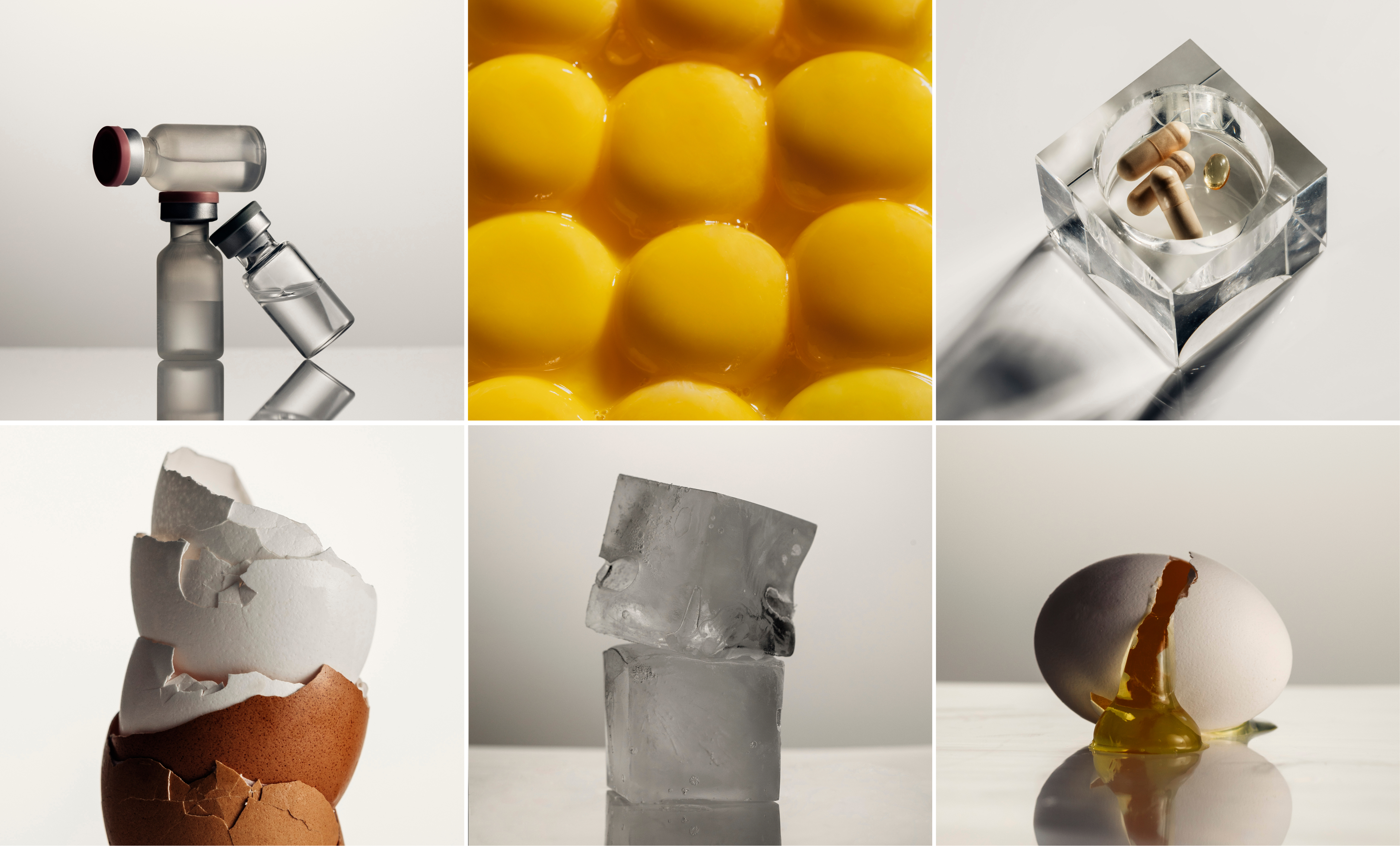
To balance the clinical precision of Swiss design with warmth, I art-directed a photoshoot that aimed to captured the intimacy of female body and to create a sense of connection by highlighting cellular-like patterns found in all living things. We also reimagined objects like IVF vials—typically associated with pain or outdated medical visuals—by placing them in a more editorial context that aligned them closer to other wellness products.
I worked with the founder to align the brand with her vision: Swiss-designed pharmaceutical packaging meets intimate, elevated and sensory.
To achieve this, I introduced a more vibrant color palette, structured gridded layouts, a more legible secondary typeface, and clear guidelines for logomark and illustration usage.
To balance the clinical precision of Swiss design with warmth, I art-directed a photoshoot that aimed to captured the intimacy of female body and to create a sense of connection by highlighting cellular-like patterns found in all living things. We also reimagined objects like IVF vials—typically associated with pain or outdated medical visuals—by placing them in a more editorial context that aligned them closer to other wellness products.
Art Direction
Creative Direction - Margaux Le Pierrès
Photographer – Daniela Spector
Light Tech – Ashley Markle
Digi Tech — Isobel Rae
Prop Stylist – Caylah Leas
Logo Design & Illustrations Abc-etc.com
Development Philip Malboeuf
daniellefertility.com
Creative Direction - Margaux Le Pierrès
Photographer – Daniela Spector
Light Tech – Ashley Markle
Digi Tech — Isobel Rae
Prop Stylist – Caylah Leas
Logo Design & Illustrations Abc-etc.com
Development Philip Malboeuf
daniellefertility.com